Background
Designlab has been asked to redesign a local, woman-owned small business, King Kog Bicycles. Established in Brooklyn in 2005. King Kog opened their west coast retail store in Oakland 2014. Originally founded as an accessories shop for messengers, the two retail locations now cater to a wide range of cycling aficionados.
The challenge
The main challenge was to add a new look and features while remaining loyal to the brand’s honest and down to earth roots. The project also had a 4 weeks time deadline.
TL;DR
Jump to different sections of this case study
Strategy & Research
Research Plan
A good move to be organised in this project was to create a research plan with timeline so that I could focus on each important step at a time.
Some of the outstanding questions were these:
- Customers are frustrated that they have to call someone up and book an appointment for repairs and maintenance, could they do this online?
- How can the shop engage with new customers and turn them into repeat customers?
- Would be great to be able to invite people to shop events, would an event calendar be a good idea? Could this help with marketing and outreach?
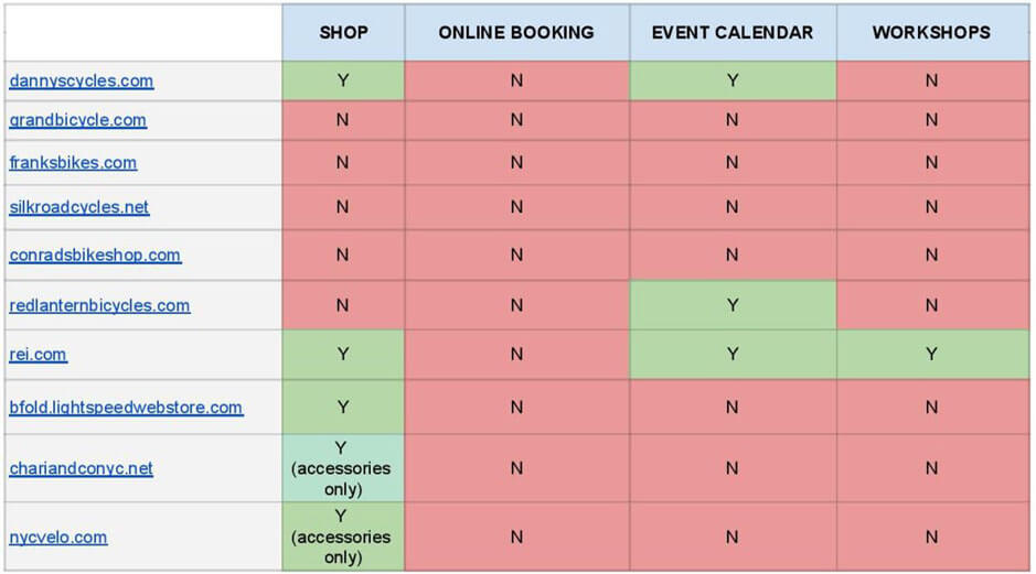
Competitor Analysis
To understand what features and services needed more focus and improvement I did a competitive analysis. I decided to check the competition for the Brooklyn store and limited the research to 10 bike shops within a 3 mile radius from King Kog’s location to answer the following questions.
- Do our competitors have an online shop?
- Do they have an online booking feature for repairs and services on their site?
- Do they have an event calendar?
- Do they host workshops?
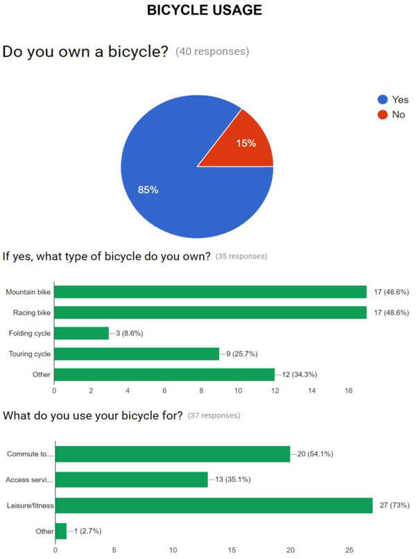
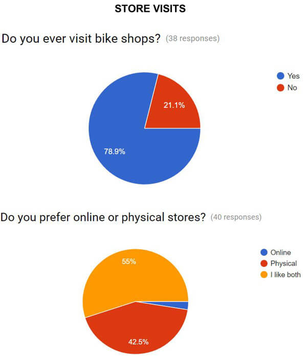
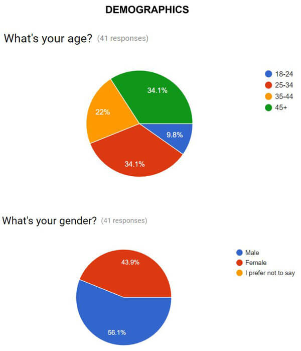
User Surveys & Interviews
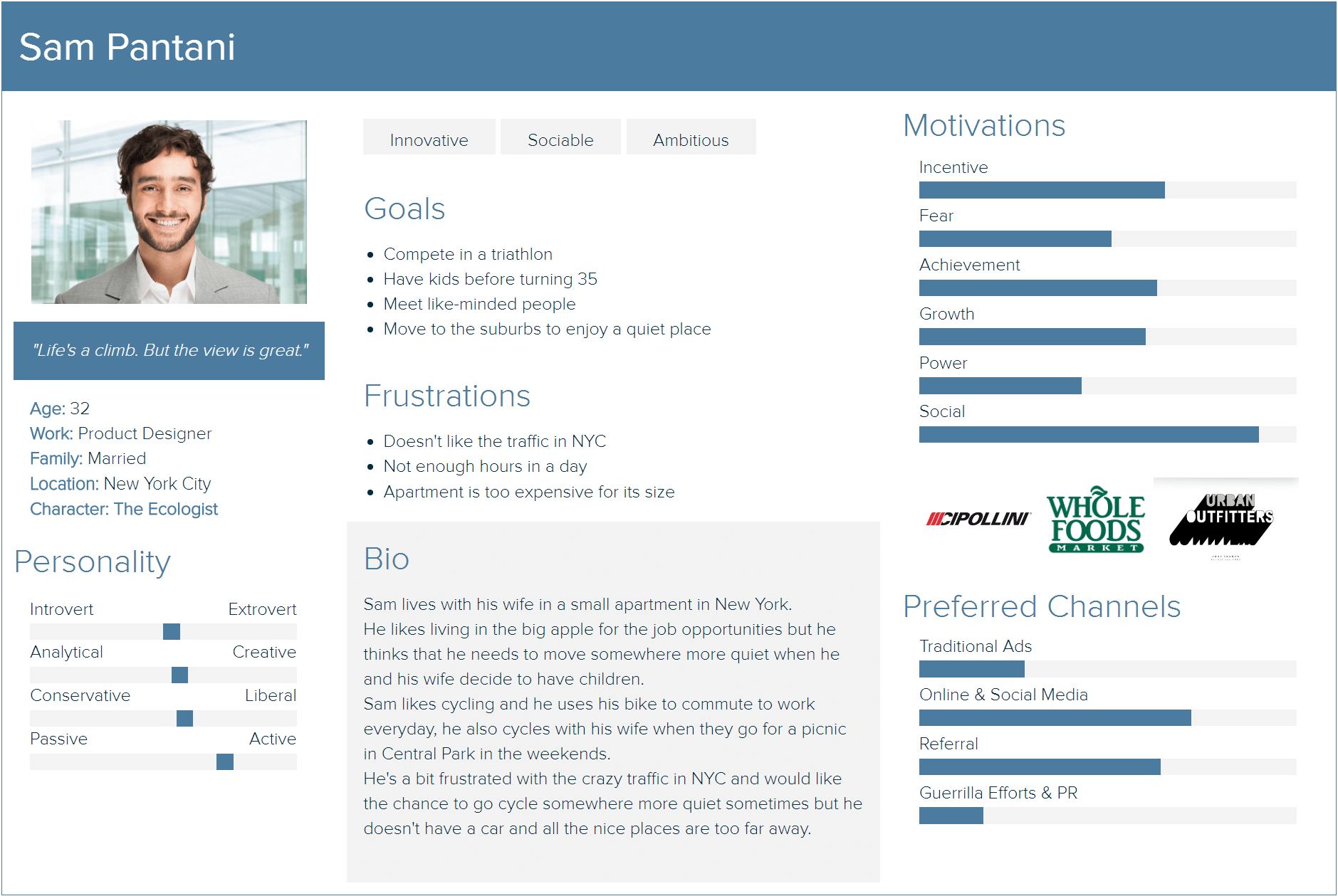
Once I gathered insights on our competitors, I wanted to get a better understanding of our target audience so I conducted User Surveys and in person User Interviews. Those helped a lot in creating the first persona.
I needed a persona so I could focus on a manageable and memorable cast of character that would allow me to design for the bigger picture.
This persona allowed me to avoid considering “personal preference” when coming up with solutions and helped me to understand our users attitudes, motivations, goals and pain points.
Research Findings
From my research findings, I believe there’s a great potential for King Kog to outperform its competitors and it can be done by:
- Redesign their online shop to showcase accessories and bikes with a particular focus on product specs and pictures.
- Add two key features to their website (event calendar and online booking)
- Engage with their audience and take advantage of the knowledge of the semi-professional bike racers that work there as mechanics (workshops).
Exploration & Prototyping
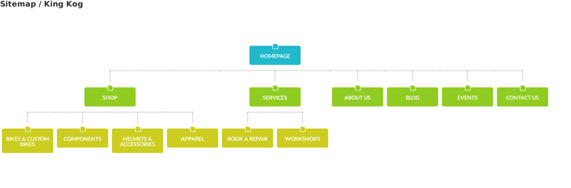
Site Architecture
Once I defined all the requirements for the redesign, I created a site map, which helped me focusing on the key design screens and overall architecture of the website.
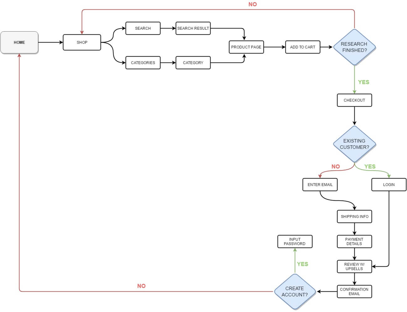
User Flows
While the sitemap helps with the structure of the website, user flows are very useful when it comes to focusing on a specific task the user needs to do when using the features we built. In this case I created a user flow for the checkout process.
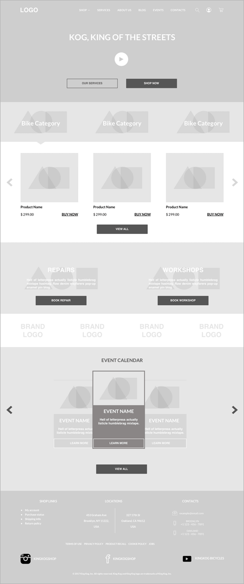
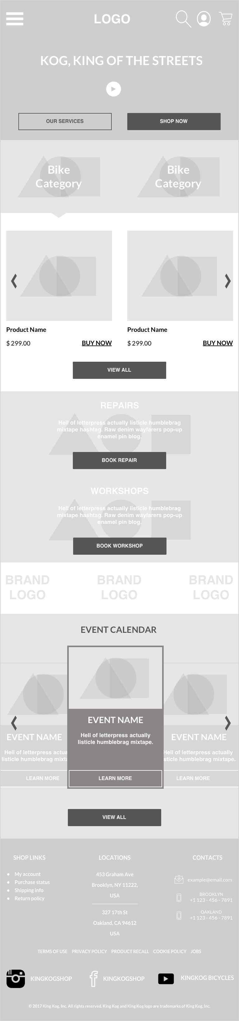
Lo-fi Wireframes & Prototype
With the sitemap and user flows at hand, I started doing some rough wireframe sketches of the main pages of the website and then proceeded in making a digital version in Sketch. Here are a few examples:

Design Production
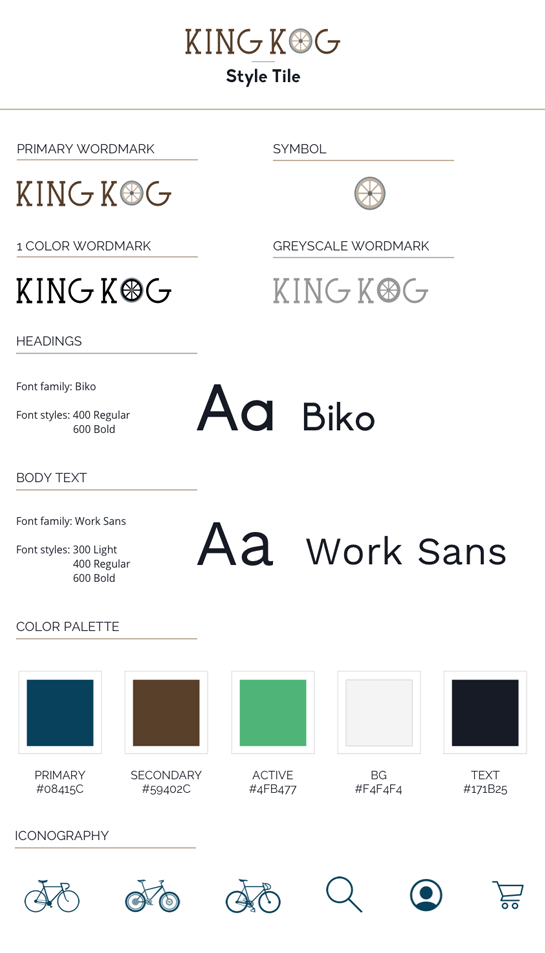
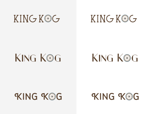
Branding
One of the main goals of this project was for the brand message to be conveyed as more professional while remaining loyal to its honest and down to earth roots. I kept that in mind when I created the logo and style tile for the new King Kog website.
Mockups
Instashop needed a fresh and clean look for the new website. I was assigned the task to create a new branding for the company and I did so by creating a new logo and a brand style tile. See the final mockups here:
Conclusions
If I had more time to work on this project I would’ve focused on improving the “book a repair” flow with more user testing and iterations. I would’ve also dedicated a few more hours to research and to interact with both cyclists and bike shop owners in the biking community to gain better insights on what’s the best way to intersect customer and business goals.


