Background
The gap between searching for a house and getting a mortgage to buy one is small, but not a simple one to fill. Money.co.uk and Zoopla tasked the mortgages team, in which I was the only designer, to improve the home buying journey by:
- Increasing revenue by catching, retaining and converting Zoopla traffic on money.co.uk
- Identifying how to help users across ZPG and have a shared understanding of the mortgage journey
- Identifying synergy opportunities (i.e. working out where users of money-Zoopla-uSwitch could benefit from services offered by one of the other sites)
The challenge
This project's concept was new and one of a kind until that time. The main challenges were:
- A limited knowledge of the user base
- The integration of new user journeys for different types of users
- Communication, different ways of working, and different tech used in the two companies
TL;DR
Jump to different sections of this case study
Strategy & Research
Research Plan
To kickstart this project, both teams needed to have an understanding of their respective target audiences and needs.
In the research plan I put together, we set out to answer the following questions:
- What challenges do our users face when applying for a mortgage?
- What are the main pain points our audience faces when looking/researching for mortgages?
- What would drive our audience to take a mortgage through us vs our competitors?
- At what point, in the Zoopla journey, do users look for a mortgage?
- What do users expect from an online mortgage journey?
We decided that we would use a mix of qualitative and quantitative research, including Market Research, Competitor Analysis, User Surveys and Polls.
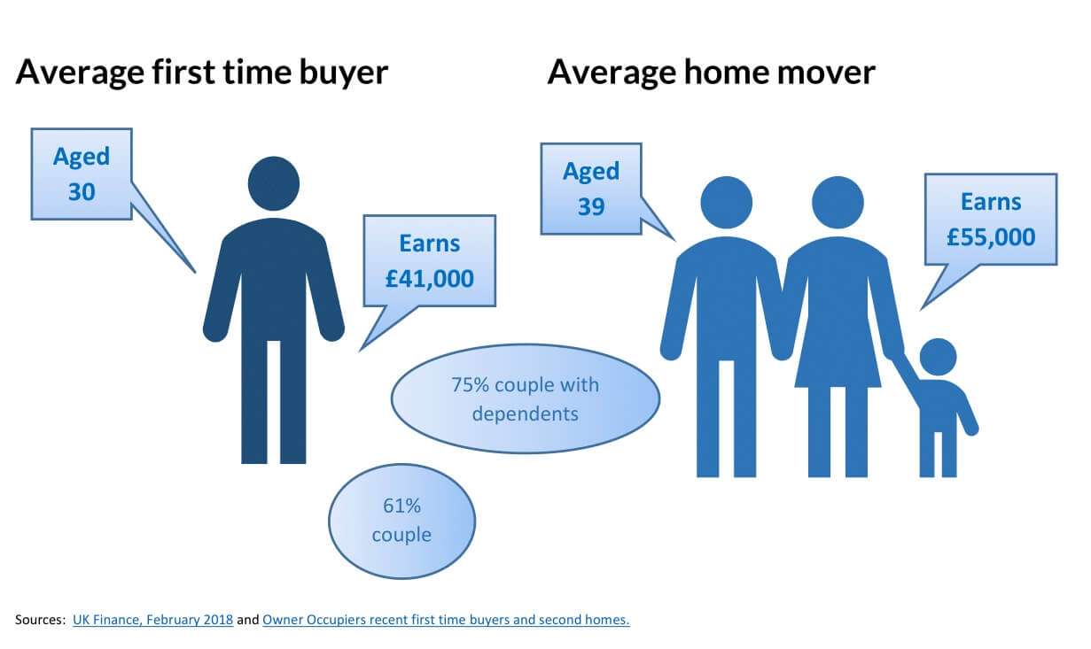
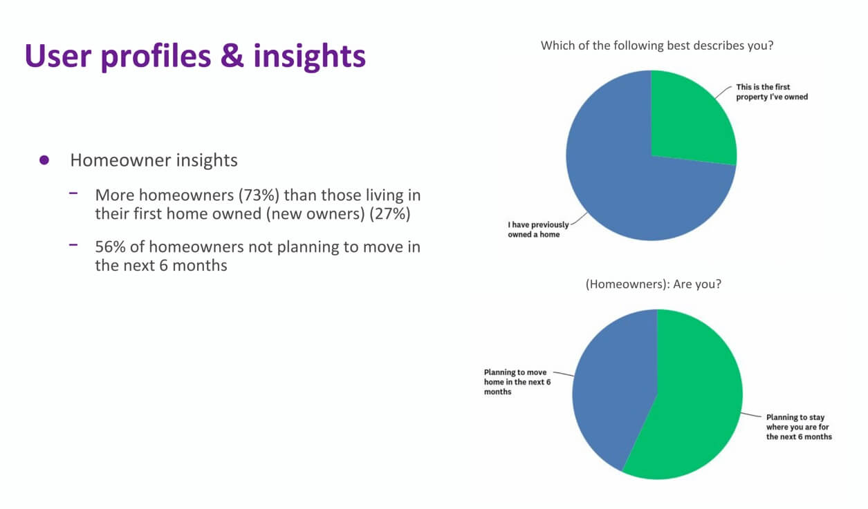
Market & User Research
Most of the initial mortgage research was carried out on the Zoopla site, due to the bigger user base. At the same time, the marketing team at Money did a more generic market research around mortgages to gain better knowledge on our user base.
By doing this, we had a chance to learn more about both of our users bases and their behaviours.
We could now approach the project with a much deeper understanding of our users intentions, and their tendencies when researching for a mortgage.
Competitor Analysis
In conjunction with the Zoopla survey and the Money market research, I decided to carry out a competitor analysis.
This would allow me to confirm there was a gap between money.co.uk and its competitors. Satisfying the user need of having an easy way to calculate and compare mortgage deals was now a priority.
In fact, this analysis showed that all major competitors had some sort of calculation tool on their mortgage pages, whereas Money did not offer that option.
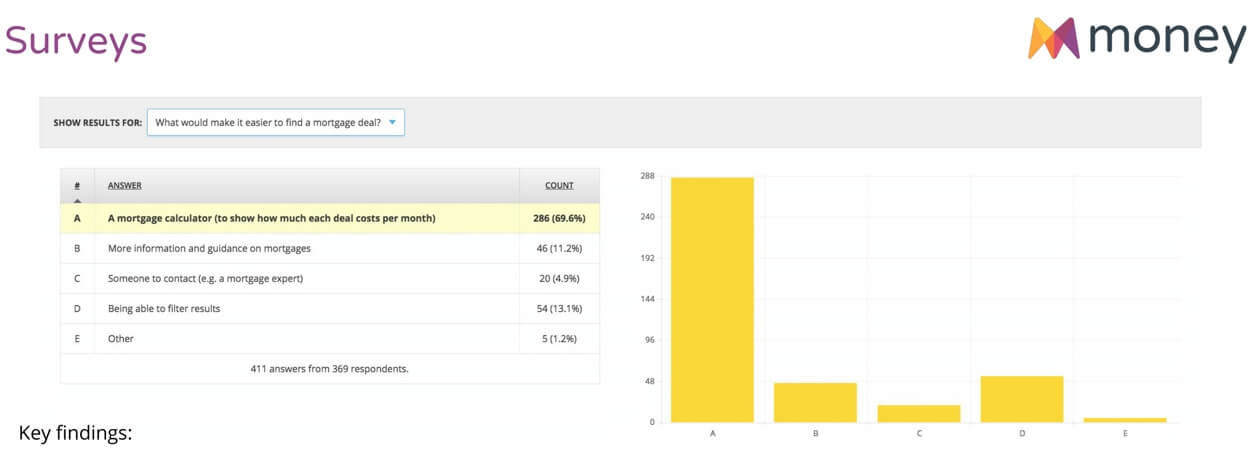
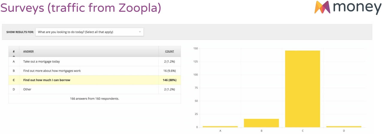
Surveys & Polls
Comparing assumptions from one user base to another proved tricky. I needed a quick way to replicate and compare Zoopla’s findings that users were expecting to see a calculator when comparing mortgages.
I decided to run some further validation on Money with some user polls, asking our users what they wanted to see on page. To no surprise, most users voted for a calculator option.
This led us to have a clear understanding — and further confirmation — of what needs had to be addressed first.
Research Findings
Research finding suggested that we focused on 3 main user needs:
- Users needed an easy way to calculate and compare mortgage deals when they land on money
- Users needed something that answered the question “Can you afford this property?” when coming from Zoopla
- Users need access to more info either through guide links, or by answering questions on the page or table.
Exploration & Prototyping
Ideating solutions
At this point, we decided to test three different solutions, but tackle one at a time. After some team refinement sessions, we had a few user stories to work on with the priority in building interactive tools (i.e. calculators) and improving the UI of the filtering system on the comparison tables.
The first and quickest solution was to focus on improving the tools and calculators on site.
User Journeys
To get an idea of where these users would come from, I took the traffic data available and started mapping some of the journeys between Money and Zoopla.
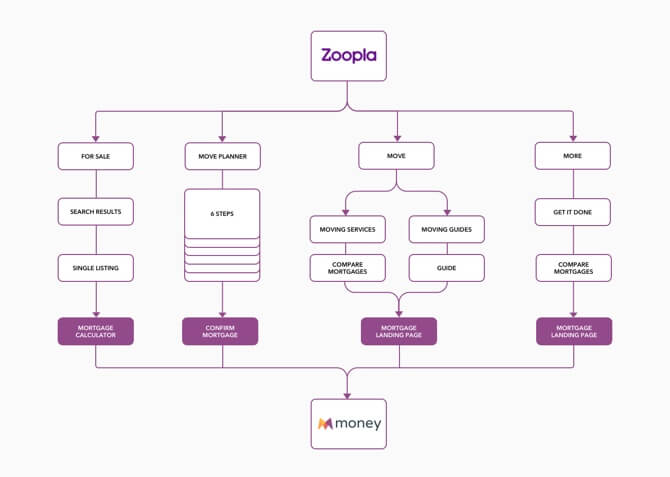
Defining Solutions
It was important for us to focus on a few solutions at a time, and to do so by addressing the main customer segments.
The main solutions we decided to focus on were:
- Reintroducing the Money mortgage calculator across mortgages —> All users
- Rework of the HMCIB calculator —> First-time buyers
- Overpayment calculator —> Remortgages and home movers
I explained the reasoning and rationale behind these choices in an internal blog post I shared with the wider company to update them on our progress.
Design Production
Mortgages Calculator
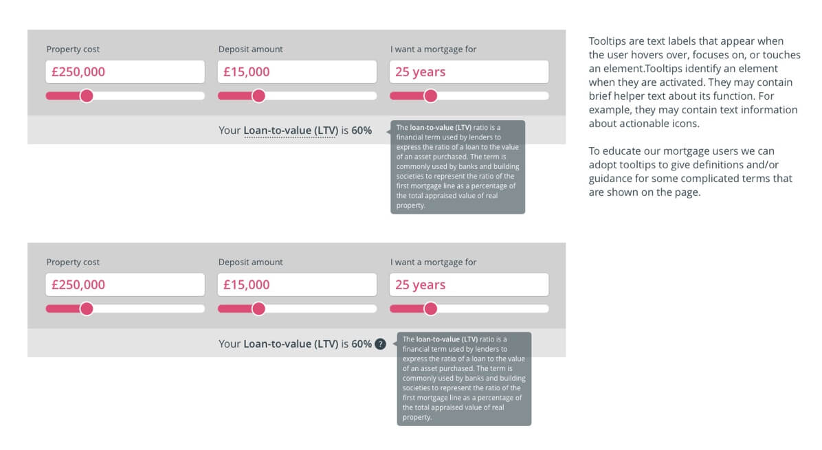
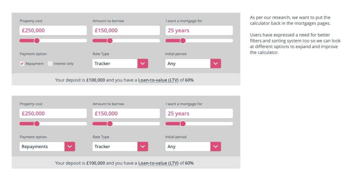
I re-designed and optimised the new calculator by taking into account our learnings from user research and feedback. I decided to re-design the UI for the calculator inputs we tried in the past, adding validation, error states and tooltips to help less savvy users understand some mortgage terms (e.g. LTV, Rate type, etc.).
This page went from a simple listing, to a filterable page on site, where users can select and filter products.
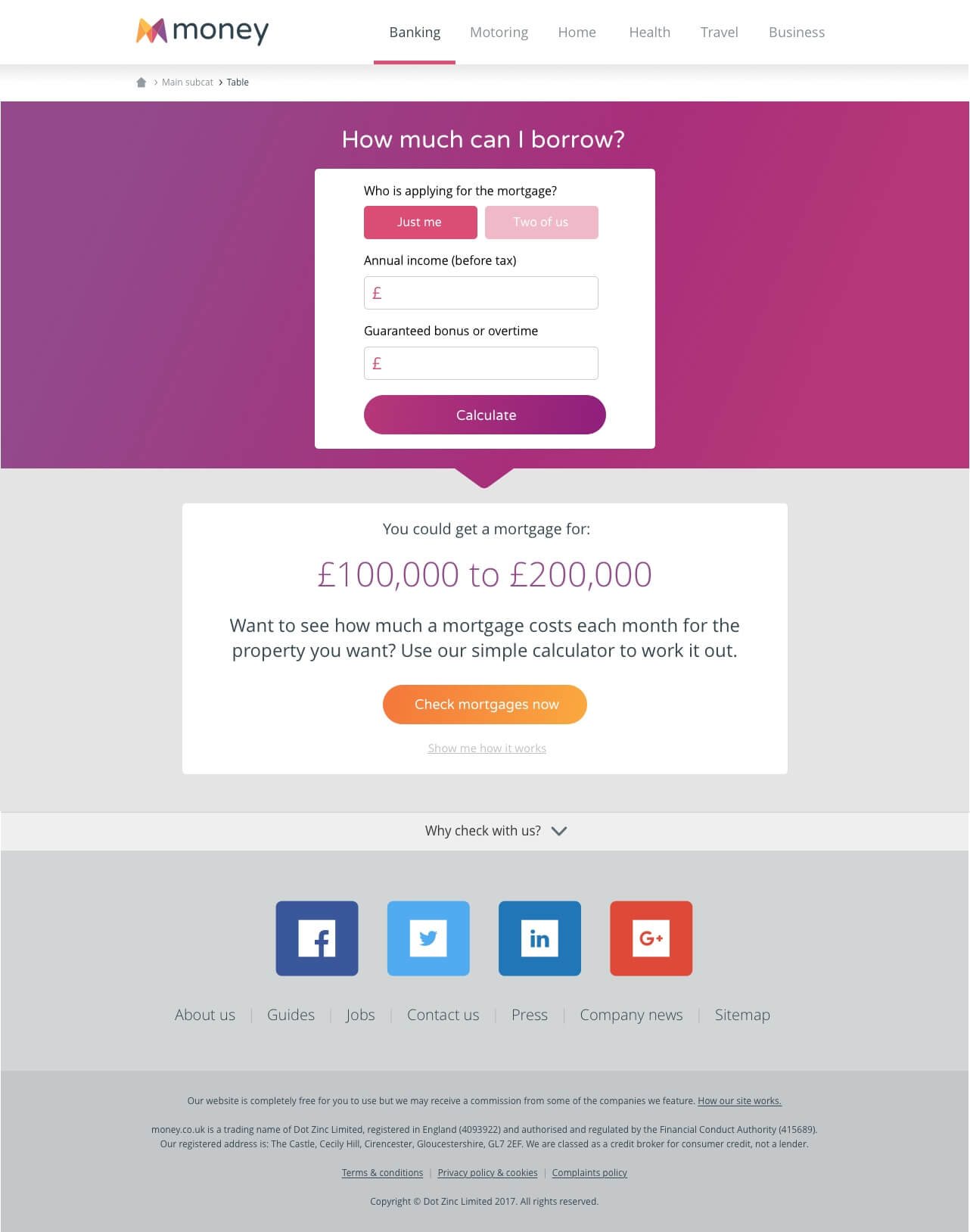
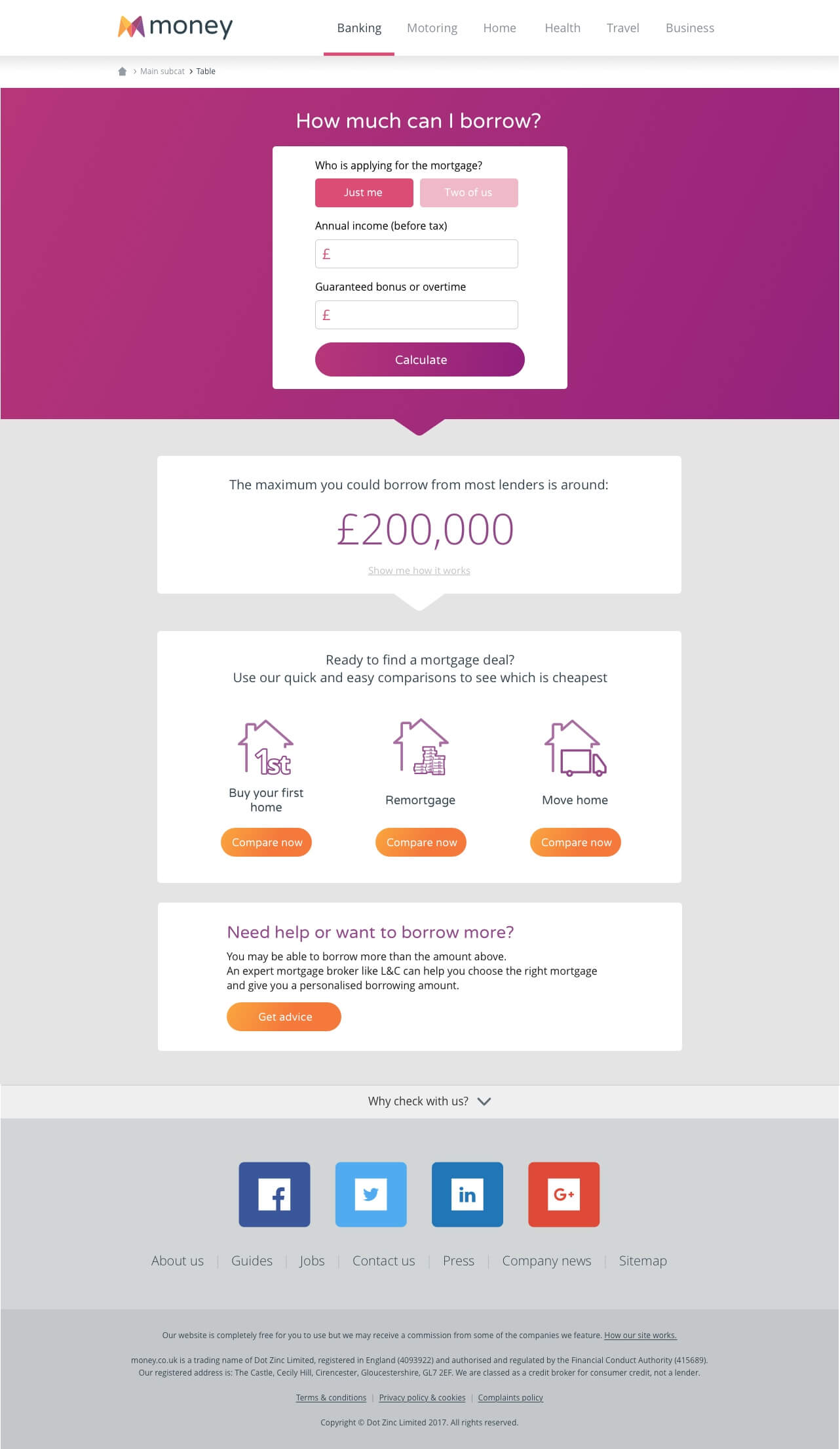
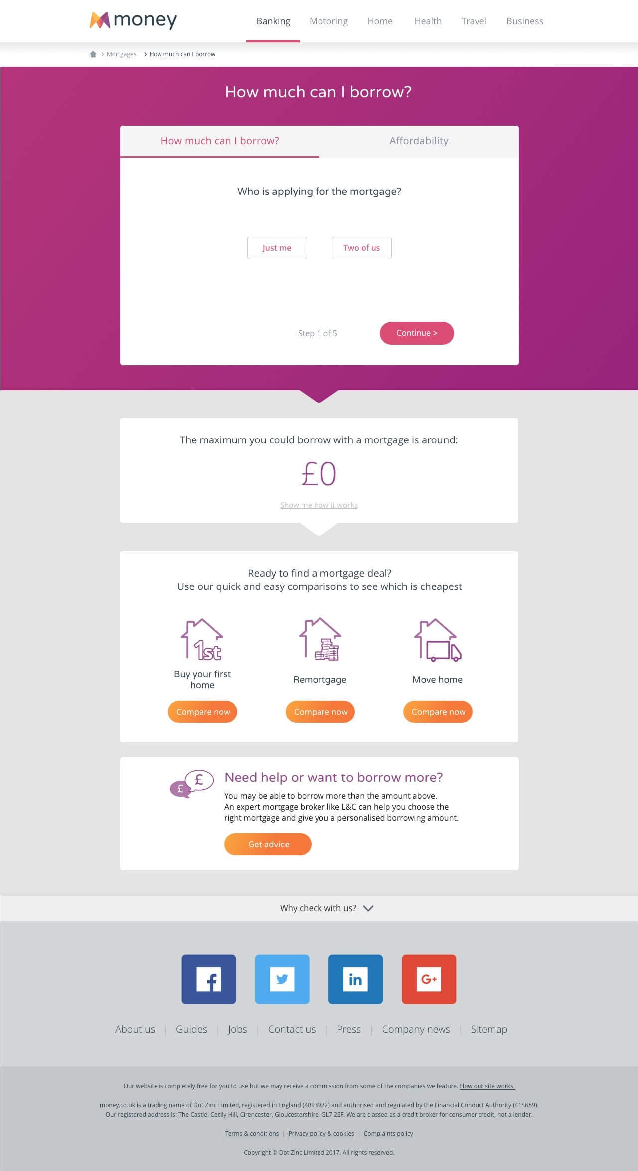
"How Much Can I Borrow?" Calculator
Users expressed the need to find out how much they could borrow when looking at a property listing on the Zoopla site. So I designed and optimised the existing Money journey, starting with the redesign of the How Much Can I Borrow (HMCIB) page.
This calculator went from a simple calculation tool to a mini interactive journey where users could answer a few questions and get results that would tell them how much they could borrow, and a suggested house price range they could afford, based on the info they input.
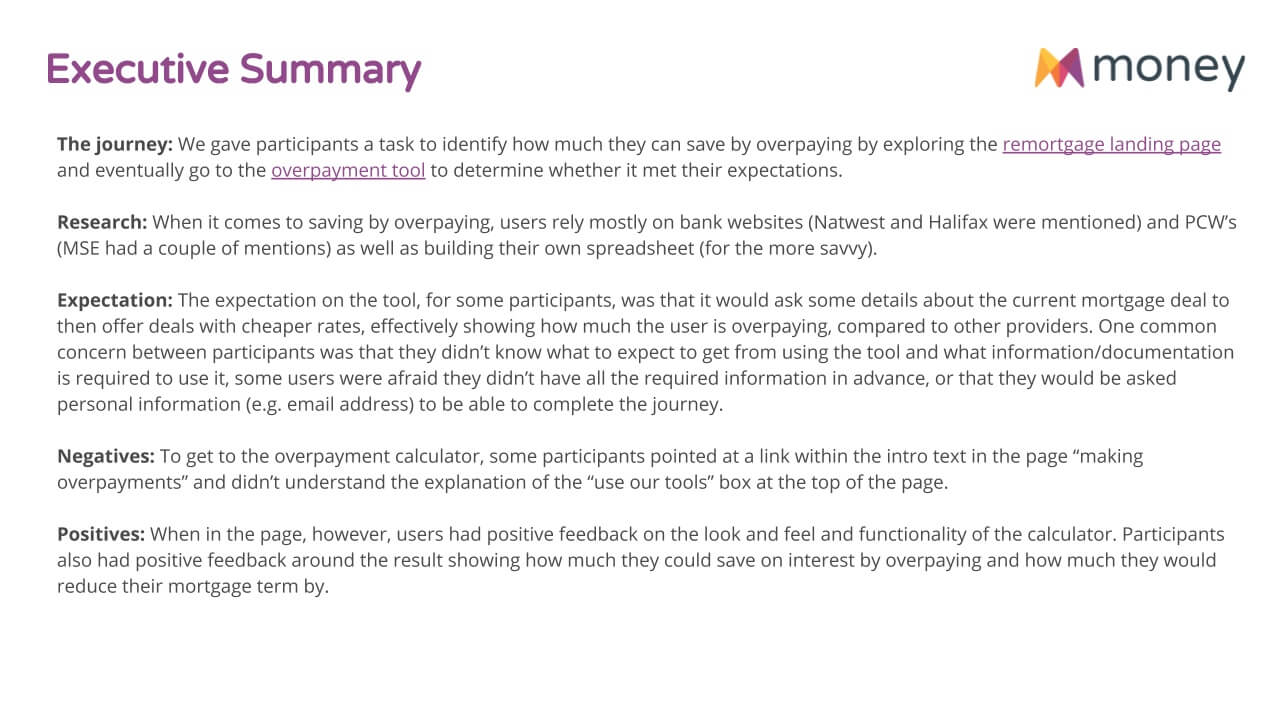
"How Much Can I Overpay?" Calculator
While carrying out some usability testing on the content pages we created for this project, some users made a comment about the lack of an overpayment calculator on money.co.uk. The team decided to address this feedback and increase the number of mortgage tools offered on site.
I designed the new overpayment calculator, a tool we didn’t previously offer, basing it on the same concept of the HMCIB calculator. For sake of consistency, the design remained the same, in the form of a tailored step-by-step journey.
The calculation result would give users an idea of how many years they could reduce their mortgage term by, and how much interest they could save on their mortgage.
Testing & Measuring
User Testing
Each project came with its challenges, however, introducing new features and tools and testing them with two different user bases was very helpful and brought many useful insights to the team.
The mortgage calculator
The initial usability testing for the mortgage calculator was run by Zoopla, given that users would start the journey on a property listing.
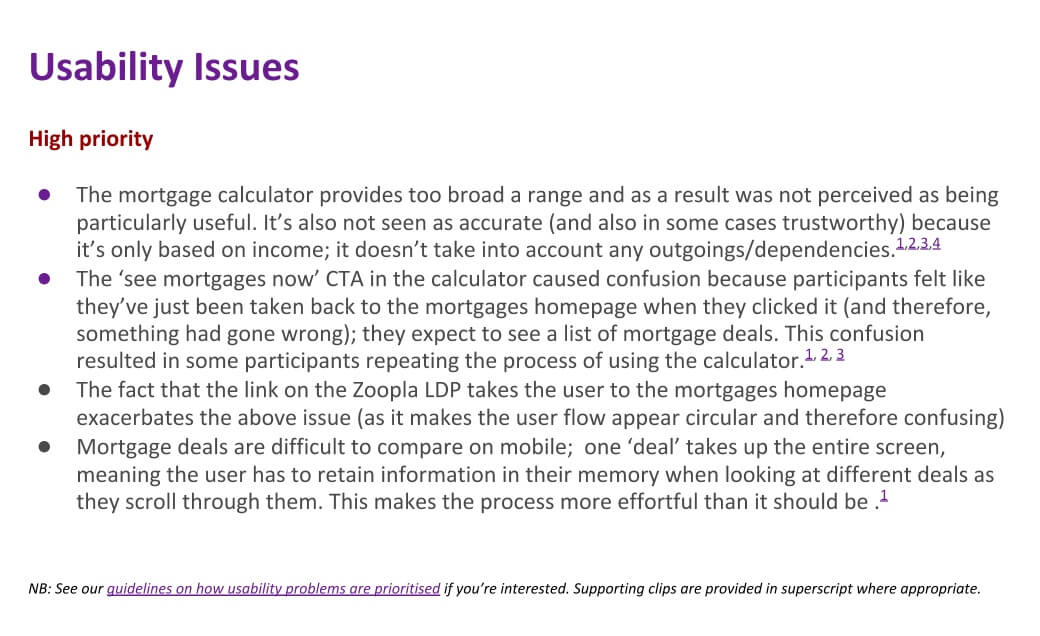
This research highlighted some usability issues the team addressed in the following sprints (e.g. input fields, tooltips, etc.)
The HMCIB calculator
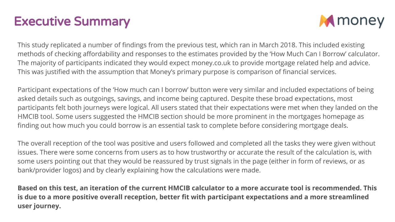
To improve the hmcib journey we decided to run some tests on the old and new version of the calculator.
This test highlighted minor issues that could get resolved with a simple round of iteration (e.g. explaining how the calculation works and prominency of the tool on the mortgages homepage).
The overpayment calculator
The overpayment calculator’s main purpose was to show users how many years they could reduce their mortgage term by, and how much interest they could save on their current payments.
Results pointed out some usability issues around the language used in-page to explain the purpose of the calculator, and the requirements to use it. The journey seemed to make more sense once users got to use the calculator and see the results.
Tracking behaviour
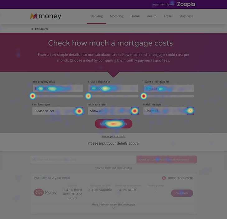
To understand where users would click out I tracked their behaviour through the use of heatmaps, scrollmaps and video recordings on Hotjar.
Users were interacting with the calculator, and if they didn’t find what they were looking for, they would abandon the page as predicted.
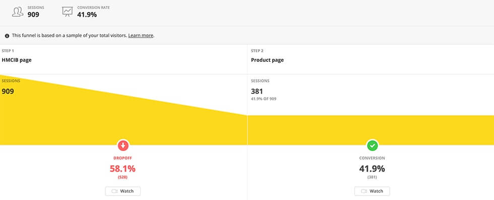
The tools pages like the HMCIB calculator and the Overpayment calculator were likely to “filter” users through to the intended product pages.
In fact, the short journey we introduced with the HMCIB calculator resulted in an increase of first time buyer users conversion of 16% compared to the previous solutions.
Based on these findings, we decided to make a first round of iteration by:
- Change input order, by asking users what type of mortgage they were looking for as first option
- Introducing tooltips to explain more complicated mortgage terms
- Changing inputs from slider to + and – to allow users to increase the mortgage amount by smaller increments
Conclusions
I was the only UX/UI Designer working on this project. Being part of an agile team dedicated to improve one of the most used sections of the website was a great learning experience.
Improving the mortgage tools as an MVP brought us lots of finding on our user base, and an understanding of what users need at any given stage of the home buying process.
If I could start this project over, I would focus on one problem at a time and make sure all the tracking is in place before moving onto the next thing. We had too many problems to tackle and too many opportunities to take advantage of to properly focus on one problem space.
If I had more time on this project I would’ve continued to test and track results in order to offer a good source of information to educate our users to make the best choice for their mortgage.


